The White-Paint Myth: Why One Sample Can Look Like Several Colours
White paint samples can look creamy, grey or stark as light and nearby colours shift. Compare them in your room to choose a shade that fits.
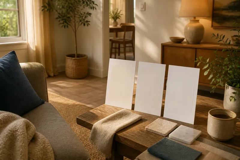
Why does the same white paint sample look creamy beside a blue cushion, then grey on the wall at dusk? White paint samples can appear to change because the light and surrounding colours affect how you see them. Comparing them in the room helps you choose a shade that suits its actual setting.
The useful question is not which white is universally pure, but which one works beside your floor, furnishings and usual lighting. A simple, consistent comparison makes that decision clearer.
White paint undertones
Paint described as white is not necessarily a neutral surface that reflects every visible colour equally. Its pigments and other ingredients shape the light it reflects. A small bias towards yellow or red can make it seem warm; a bias towards blue or green can make it seem cooler. These subtle tendencies are called undertones.
Undertone is not the same as apparent brightness. Two samples can both seem pale while one looks creamy and the other crisp. Nor does a warm undertone mean the paint will look yellow in every room. The light reaching the surface and the colours beside it affect the appearance you see.
A tiny printed chip can be misleading. Surrounded by a broad strip of white card, it may seem muted; placed against a warm wood floor, the same chip may read cooler by comparison. The sample has not changed. The visual relationship has.
Choosing paint samples
Before buying sample pots, note the fixed colours in the room: flooring, worktops, tiles, curtains you intend to keep and large upholstered pieces. These are the neighbours your paint will have to live with. A photograph or a small, clean material swatch can help you compare options at the paint counter.
Choose a small group of whites with noticeably different possible undertones: one warmer, one cooler and one that appears more neutral. The aim is to make differences visible, not to collect several nearly identical chips.
Ask for samples in the finish you expect to use, or check the paint maker’s guidance on how its sample product relates to the final finish. Sheen can affect how strongly a surface reflects light, so a sample painted in one finish may not look exactly like a wall finished in another. Follow the product label and manufacturer’s instructions for application and drying.
Making useful sample boards
Paint each candidate on a separate piece of white card or removable sample board. Use boards of the same size and apply the paint similarly, so the comparison does not depend on a thicker coat or a different base showing through. Let each one dry as directed before judging it.
A board is more useful than a dab on a wall because you can move it. Hold it near the floor, beside a curtain and against a large piece of furniture. Then place it on more than one wall. A colour that looks balanced against a pale wall may appear distinctly pink or green beside another surface.
Keep some unpainted card visible around the sample, but do not treat the card as a perfect reference white. Its own colour and the colours around it can influence the comparison. Judge each candidate in the setting where it will be seen, rather than trying to decide what it looks like in isolation.
Comparing room light
Look at the boards in daylight and under the electric lights you normally use. Daylight changes in colour and direction as the day passes; a wall facing a window may receive a different balance of light from one in a shaded corner. A sample can therefore look crisp in bright daylight and softer or more muted when the room is lit by lamps.
Do not assume that a bright room will make every white look brighter. Nearby colours can alter the impression: green foliage outside a window, a coloured rug or warm timber may lend a cast to reflected light. At night, the lamp itself matters. Different bulbs can make a white seem warmer, cooler or less distinct, so compare samples with the lighting you plan to keep.
Check the board from places where you actually view the wall, such as the doorway, sofa or kitchen table. An angle can change how much light reaches and leaves a surface. Look at samples in naturally sunlit and shaded parts of the room; one glance at midday is not a final verdict.
Surrounding colours and contrast
When a white seems to have a surprising tint, look at what sits beside it before rejecting it. A cool-toned white next to warm beige may appear bluer than it did alone. A creamy white next to a blue-grey sofa may seem more yellow. This contrast is a perceptual effect: a neighbouring colour changes how you interpret the sample.
Move the board away from the strongest nearby colour and compare it with the room again. If the cast seems to change, contrast is part of the impression. That does not make the effect irrelevant; it tells you what the paint may look like once it shares a wall or corner with that furnishing.
Say you have a grey sofa, a honey-coloured floor and two white boards. One seems slightly blue beside the floor, while the other looks creamy next to the sofa. You move both boards between the sofa and floor, then check them beside a curtain in daylight and under your usual lamp. The resulting comparison shows which sample sits more comfortably with the room’s colours and lighting, without declaring either one objectively whiter.
White paint samples: common questions?
Why does white paint look yellow?
A warm undertone can become more noticeable beside cool colours, while warm-looking illumination may reinforce a creamy impression. Check the sample against permanent room features and under the lamps you use, rather than judging it against one sheet of paper.
Why does the same sample look grey?
Dim or indirect light can make a pale surface seem less bright, while nearby colours can alter its apparent cast. Compare the sample on different walls and at different times before deciding that the paint itself simply looks grey.
Can I trust a paint-shop colour card?
A card is helpful for narrowing choices, but its small area and the shop’s lighting cannot show exactly how a larger painted surface will appear at home. Use it to choose candidates, then compare larger samples in the room.
Should the ceiling and trim use the same white?
That depends on the effect you want and the colours of nearby surfaces. A shared white can make boundaries feel quieter, while related whites with different undertones can make edges more apparent; compare samples beside each other before choosing.
Making the final comparison
Once you have looked at the boards in place, narrow the choice to samples that work with the room’s fixed colours in daylight and evening lighting. Move the strongest contenders between the main walls and leave them where you can notice them during ordinary use. Looking at each under several conditions is more informative than holding them together under one lamp.
When two choices still seem close, ask what you want the walls to do beside the room’s most prominent materials. A cooler white may make warm wood stand out more; a softer, warmer white may make the transition gentler. These are design preferences, not signs that one sample is more accurate.
White paint samples are easiest to judge in their intended setting, not in isolation. Compare them beside the room’s fixed colours and under its usual lighting; that gives you a more useful answer to which white looks right in your home.